

Making Segmented Pyramid with CSS


Hello Everyone! I hope you are doing well. In this blog I will show you how I built a segmented pyramid or a 'triangle inside triangle' div.
But why are we doing this?
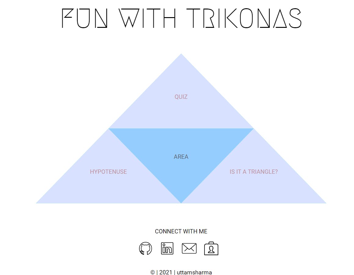
Well admittedly this does not seem like something useful but I wanted to create some new design for the landing page of a small vanilla Javascript project I was making. The project was a task of neog.camp called fun with triangles. My project can be seen here. I used the segmented pyramid as a link/button group to the different parts of project. Disclaimer: I am a web dev beginner and my methods may not be the best, also I could not find how to do something like this elsewhere so I tried to experiment and make it myself.
Things to know
- CSS clip-path
- The display property
- CSS positioning
CSS clip-path
This is arguably the most important topic we need to understand in order to create shaped divs in CSS. From Mozilla developer network, the clip-path CSS property creates a clipping region that sets what part of an element should be shown. Parts that are inside the region are shown, while those outside are hidden. Keep in mind that only the part shown is usable or active by which I mean if there is something like a link in the hidden region, it will not be "clickable".
Clip path syntax
clip-path: clip-source|basic-shape|margin-box|border-box|padding-box|content-box|fill-box|stroke-box|view-box|none|initial|inherit;
This is really exhaustive but fortunately for our use case polygon is sufficient.
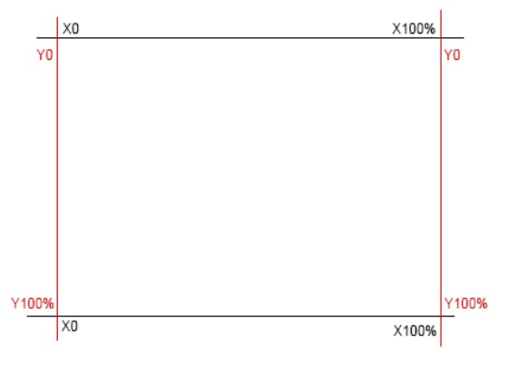
coordinate system
The clip path essentially is a series of coordinate pairs which are separated by a commas. This coordinate system starts from the top-left corner. Coordinates are grouped as X Y pairs where X is horizontal axis and Y is the vertical axis. Coordinates of the top-left corner are Y0,X0. As we got to the right, X coordinate increases and as we head to the bottom the Y coordinate increase. The bottom right corner’s coordinate is X100% Y100%.
If I were to make a rhombus with equal diagonals, I would do clip-path: polygon(50% 0%, 100% 50%, 50% 100%, 0% 50%);. With polygon you can have as many vertices as you want. See the next codepen and notice how the text tries to fil the width of rhombus' box model.
For triangles, clip path will be clip-path: polygon(100% 100%,50% 0%, 0% 100%); or clip-path: polygon(50% 0%, 0% 100%, 100% 100%);. Also notice that the order of coordinates does not matter, the resultant shape will be filled anyway. And for the upside down triangle, clip-path: polygon(0% 0%, 100% 0%, 50% 100%);
clippy is a great tool by Bennett Feely. It is an online clip-path generator that helps creating shapes. You can select from a range of provided shapes or can even create a custom shape. Then you can get the desired look by moving the points over the image, once you have the perfect shape, the css code is automatically generated.
Display property
The display CSS property sets whether an element is treated as a block level or an inline element and the layout used for its children, such as grid or flex. The most common values for the display property are: block, inline, inline-block and flex.
block
The element generates a block element box, generating line breaks both before and after the element when in the normal flow. This also implies that width of element by default is 100% or it takes full width of parent container. You can add margins and padding on all four sides of any block element — top, right, left, and bottom. These elements can have height and width but not padding. Some example of block level elements are <div>, <p> and headings <h1>, <h2>...
inline
The element generates one or more inline element boxes that do not generate line breaks before or after themselves. You can add space to the left and right on an inline element, but you cannot add height to the top or bottom padding or margin of an inline element. Any height and width properties will have no effect.
inline-block
Inline-block elements are similar to inline elements, except they can have padding and margins added on all four sides. In other words, it is just like a block element but it appears in line with other content.
flex
The element behaves like a block element and lays out its content according to the flexbox model.
The main idea behind the flex layout is to give the container the ability to change it's childrens' width/height (and order) to best fill the available space (mostly to accommodate to all kind of display devices and screen sizes). A flex container expands items to fill available free space or shrinks them to prevent overflow.
There are two groups of properties associated with display: flex - container properties and flex item properties.
The two properties we need for this project are: flex-direction and flex-basis. Although admittedly we don't really need flex-basis.flex-direction is a container property and can have either row or column as its value and it will arrange it's children in accordance with the value specified i.e. horizontally or vertically. Default value of flex-direction is row.flex-basis is a flex item property and can have a length (e.g. 40%, 3rem, etc.) or a keyword. The auto keyword means “look at my width or height property”. The content keyword means “size it based on the item’s content”. It is like specifying the width or height of the item but the difference being that it will behave like width if flex-direction is row and height if the flex direction is column.
CSS positioning
The position property specifies the type of positioning method used for an element i.e. it can help you manipulate position of an element.
Position syntax
position: static|absolute|fixed|relative|sticky|initial|inherit;
Again this will be a lot so we will keep it brief and ignore the values not needed for our project.
position: static : every element has a static position by default, so the element will stick to the normal page flow. So if there is a left/right/top/bottom/z-index set then there will be no effect on that element.position: relative : an element’s original position remains in the flow of the document, just like the static value. But now left/right/top/bottom/z-index will work. The positional properties “nudge” the element from the original position in that direction.position: absolute : the element is removed from the flow of the document and other elements will behave as if it’s not even there whilst all the other positional properties will work on it. The element is positioned relative to its first positioned (i.e. not static) ancestor element. However, if there is no positioned ancestor, the containing block is the initial containing block (i.e., the viewport).
Creation
We have acquired all the necessary knowledge in order to create the segmented triangle. So let's just do it. The idea is to create a triangle case (biggest triangle) and make separate triangle children inside it. We will also try to make it flexible or responsive. For this, I divided the triangle into two parts, namely the "top triangle" and the "row". The row will house the three inline (actually: inline-block) children.
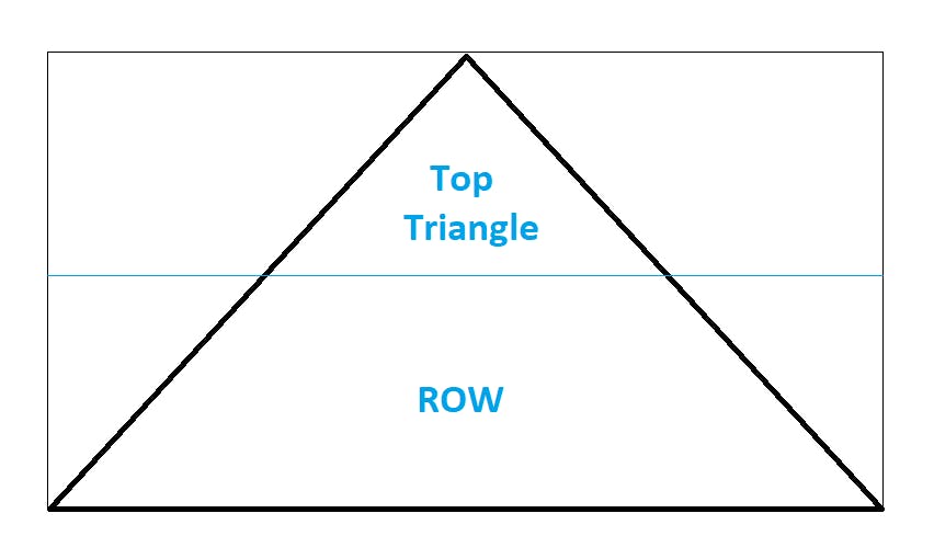
The thick black outline is the triangle case.
<div id="case">
  <a href="https://stackoverflow.com" class="triangle top"></a>
  <div class="row">
  </div>
</div>
I then made three anchor tag children inside the row container. Remember to wrap the text inside the links in a <p> tag so you can position text inside the triangle later.
<div id="case" class="triangle">
  <a href="https://stackoverflow.com" id="top" class="triangle"><p>SO</p></a>
  <div class="row">
  <a  href="https://reddit.com" id="left" class="triangle"><p>reddit</p></a>
  <a href="https://google.com" id="invert" class="triangle"><p>google</p></a>
  <a href="https://youtube.com" id="right" class="triangle"><p>youtube</p></a>
  </div>
</div>
Now onto the CSS part.
#case {
  background-color: skyblue;
  width: 50vw;
  height: 100vh;
  text-align: center;
  display: flex;
  flex-direction: column;
  position: absolute;
}
Giving the case a background-color helps us visualize the position of elements. The height and width values are obviously taken as an example and you can use whatever suits your design. We made the case flex so it can be resized and the the two parts i.e. the top and the row can be used as columns. Also it will become harder to position the children without it. Absolute positioning makes it non-static as the children inside will be placed according to this case and also now the case can be positioned anywhere on the viewport.
As most elements are triangle it makes sense to make a triangle class so that every element can inherit its values and we won't have to write the same things everywhere.
.triangle {
  clip-path: polygon(0 100%, 50% 0, 100% 100%);
  background-color: aquamarine;
  position: absolute;
}
And so we come to the "top triangle".
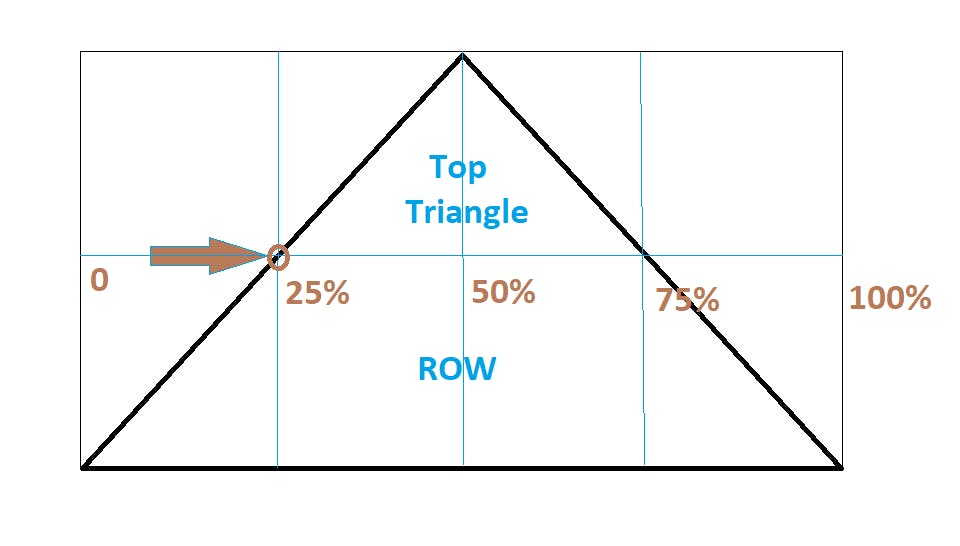
#top {
  position: relative;
  flex-basis: 50%;
  width: 50%;
  left: 25%;
}
We position it relative and move it to the right by nudging it from the left by 25% because if you remember the clip-path only hides the unwanted part but the children can still be placed in the hidden part. And if you are wondering why 25%, here is an MS-paint sketch:
Okay with that done now we style the triangles inside the row.
.row .triangle {
  display: inline-block;
  height: 50%;
  width: 50%;
}

#left {
  left:0;
}

#right {
  right:0;
}
We make these inline block because we want them behave inline obviously and also it would be easy for us if we can use width and height properties. The only difference between the left and right triangles is their position. Setting the right triangle to right: 0 makes the end vertex of triangle stick to the last vertex of triangle case.
#invert {
  clip-path: polygon(0 0,100% 0, 50% 100%);
  background-color: #FFC7FC;
  left: 25%;
}
For the upside down triangle in the middle of the row the clip path will be different. Also it should be positioned 25% from the left just like the top triangle. Make it a different color so that it looks like a segmented triangle.
And wow we already made all of it, well almost. Just style the links and paragraphed text and we are done.
a {
  text-decoration: none;
}

.triangle p{
    position: absolute;
    left: 50%;
    top: 50%;
    transform: translate(-50%,-50%);
    text-transform: uppercase;
}

#invert p {
    top: 25%;
    color: #59656F;
}
Positioning the paragraphs absolute and using translate makes the text be in center of the triangle otherwise it remains at the top.
Here is the final code:
And finally we have completed it. I hope this article helps you in your design and if it does please comment because knowing you helped someone is pleasure.
Thanks for reading. Peace! ✌️